
Project presentation
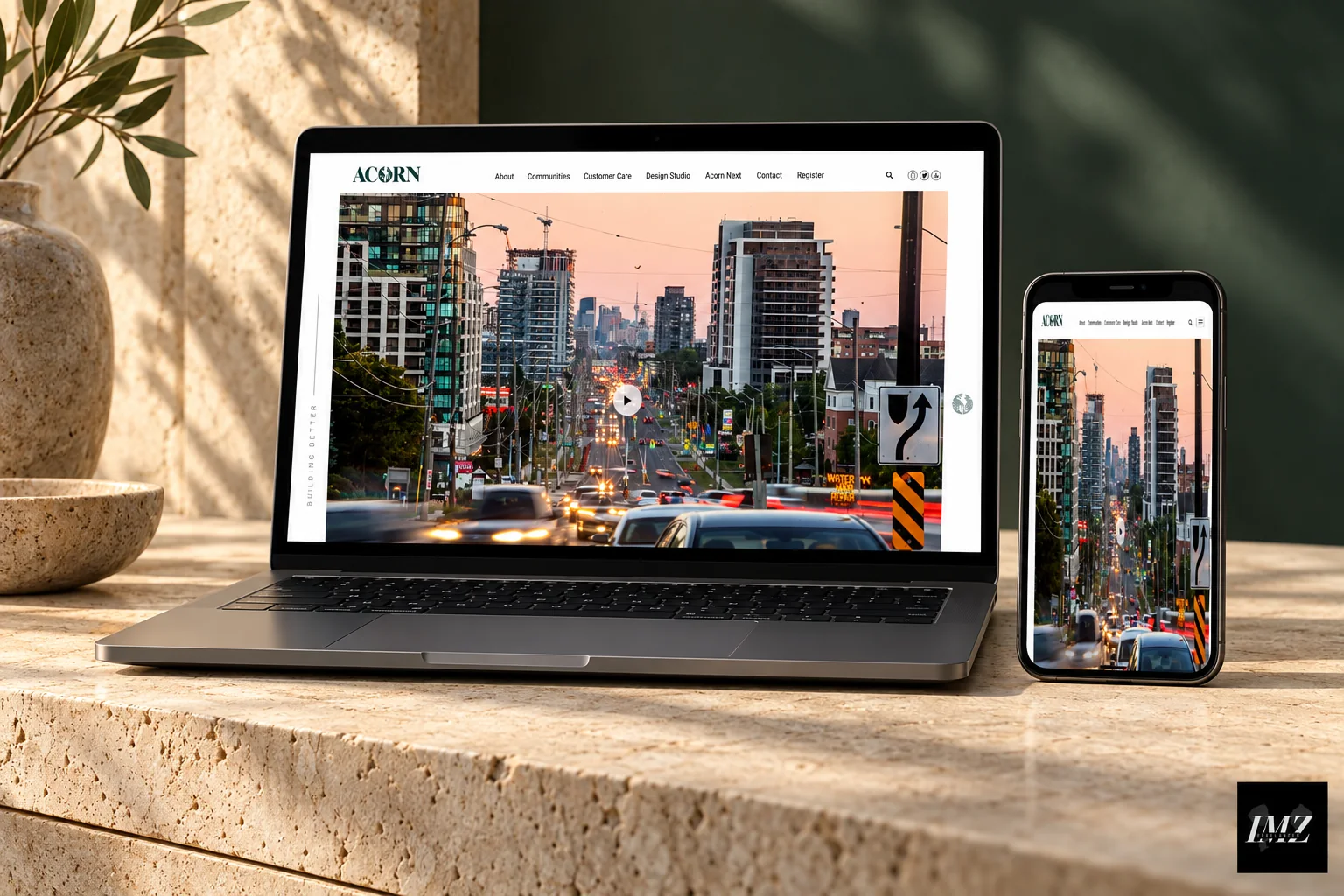
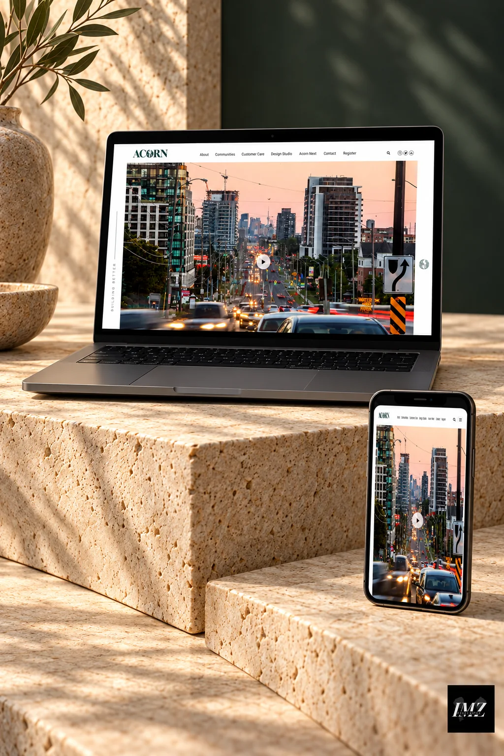
A large urban photograph opens the page, while light navigation provides a clear entry point to the content.
The contrast between photography and white space keeps the places being presented at the centre of the experience.
Presentation mockups created with AI assistance from the supplied project visuals. Fine screen details may differ from the original reference.
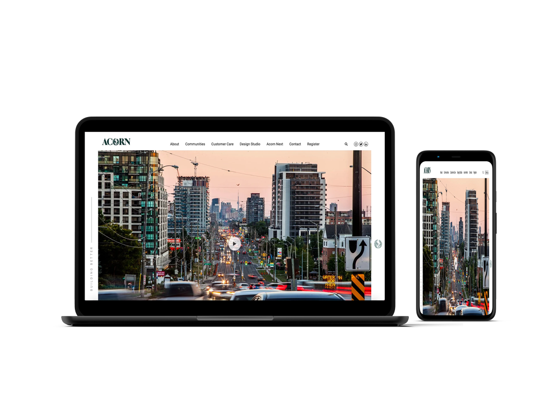
In real estate website design, the first image does most of the selling. For ACORN, a large urban photograph opens the page and sets the tone before a single word is read, while a light navigation bar keeps every section within reach.
The structure supports how buyers actually browse: communities and projects first, then details, then a clear way to get in touch. White space around each image keeps the focus on the places themselves, and large visuals are compressed and sized for each screen, following Google’s image best practices, so pages stay fast.
Behind the scenes, each project page follows the same template: a hero image, a short introduction, key facts and a contact block. This consistency makes the site easy to extend when new communities launch, and it gives search engines a clean, predictable structure to index.
The same approach works for developers, agencies and brokers who need their properties to look as good online as they do in person, from Toronto to Casablanca.
Good real estate website design also anticipates the questions buyers ask most often, about location, timelines and pricing, and answers them clearly on the page, which builds confidence before the first call.
Finally, every page includes clear calls to action, local business details and structured data, so the project can be found in search results and visitors always know the next step, whether that is booking a visit, downloading a brochure or speaking with the sales team.
Strong photography, a clear structure by community or project, fast loading on mobile and visible contact options on every page. Visitors should understand where a property is and what makes it special within seconds.
Images are exported at the right dimensions, compressed in modern formats and loaded only when they come into view, so the site stays quick even with full-width photography.
Yes. Each project or community can have its own page with images, key details and a contact form, all managed from WordPress.
Yes. Layouts are designed for phones first, which matters because most property searches start on a mobile device.
Yes. Pages are built with WordPress and Elementor, so your team can add projects, replace photos and edit text without a developer.
Yes. I have a Toronto business presence and work with developers, agencies and brokers in Toronto and the GTA, as well as clients in Morocco and France.
Yes. Project videos or drone footage can be embedded and loaded only when visitors press play, so they never slow the first view of the page.
It depends on the number of projects and pages and how ready the photography is. You receive a timeline with clear milestones after the first call.
Discovery, structure and wireframes, a custom visual design, WordPress and Elementor development, image optimisation, on-page SEO and a hand-over session for your team.
Next project
Tell me about it and I will reply with a clear next step.